Experiments · Cartography

North is a choice.

So is the projection, the color, and which places get a name. A map looks like a picture of the world. It is an argument about it.

Four plates. One of them is a copy of a New York Times map, printed next to the original so you can judge it.

Plate I · A copy, on purpose

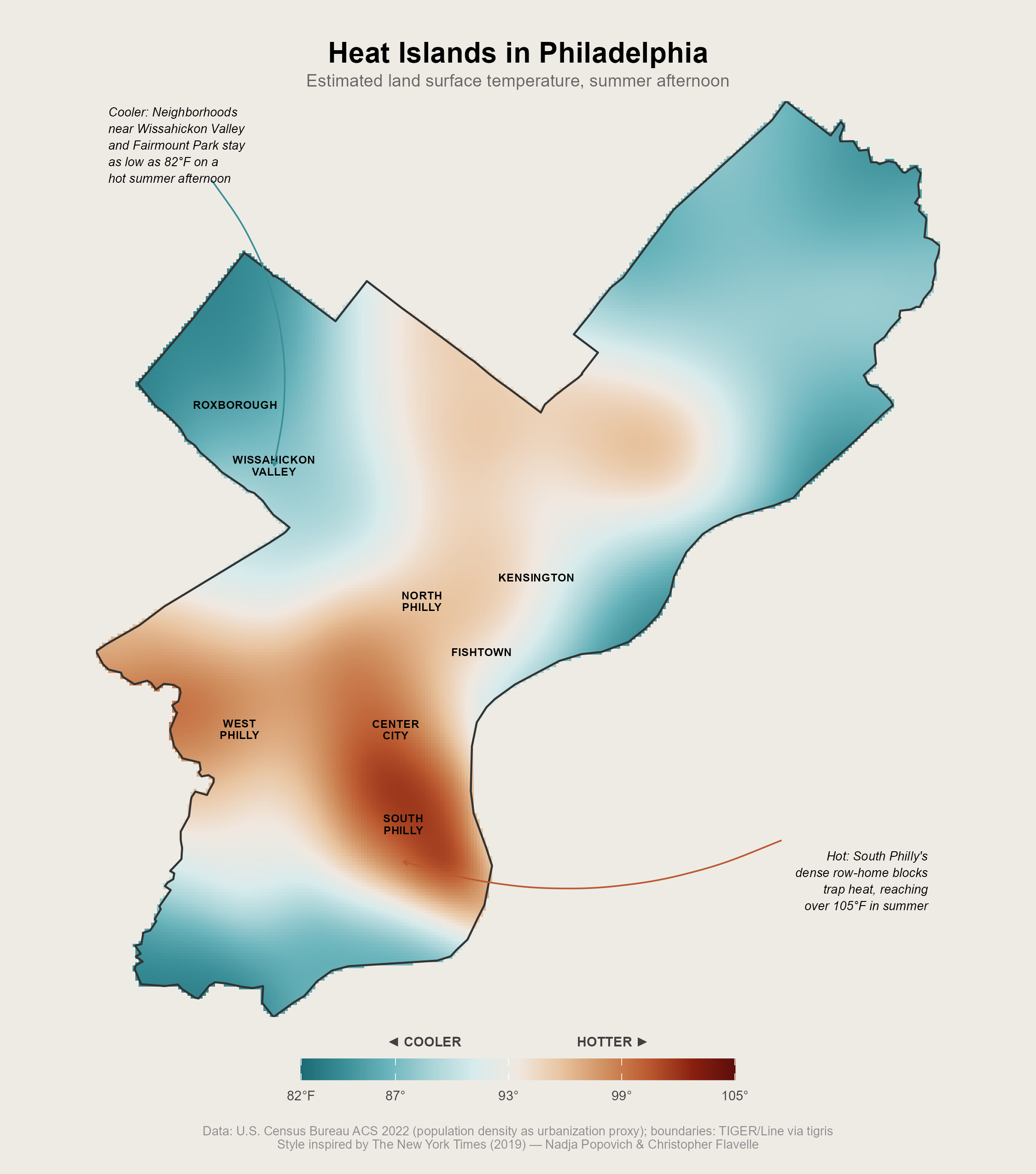
Heat Islands in Philadelphia

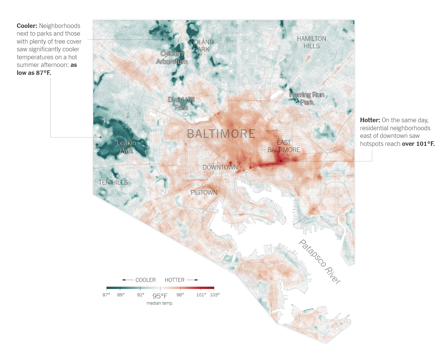
The Times mapped Baltimore in 2019. I rebuilt it for Philadelphia to see how much of what works is craft and how much is data. Mostly craft.

Shows
Surface heat, one summer afternoon
Data
ACS 2022, TIGER/Line
Color
Teal to rust, neutral at 93°F
Made in
R
Mine · Philadelphia Map of Philadelphia showing estimated land surface temperature on a summer afternoon, with cool teal areas near Wissahickon Valley and hot rust-colored areas in South and West Philadelphia.
Same scale, same two annotations, same cooler and hotter bar.
Reference · Baltimore Reference graphic: The New York Times 2019 map of heat islands in Baltimore, showing cooler areas near parks and hotter areas east of downtown.
“Summer in the City Is Hot, but Some Neighborhoods Suffer More”, The New York Times, August 2019, by Nadja Popovich and Christopher Flavelle. Shown here as the reference for a study exercise. All rights remain with the publisher.

What I kept

  • A diverging ramp with a real middle.
  • Two annotations, each ending in a temperature.
  • Neighborhood names on the map, small, in caps.
  • No basemap, no north arrow, no scale bar.

What I could not match

  • Theirs is satellite heat. Mine is a density proxy.
  • They draw the street grid inside the surface.
  • Their labels were placed by hand, and it shows.
  • Theirs sits in a city. Mine floats on the page.

My first try used a plain ramp and the whole city looked warm. True, and empty. A diverging scale makes you say what counts as normal.

Then the parks and the row homes pulled apart on their own. Twenty degrees, one afternoon, two blocks.
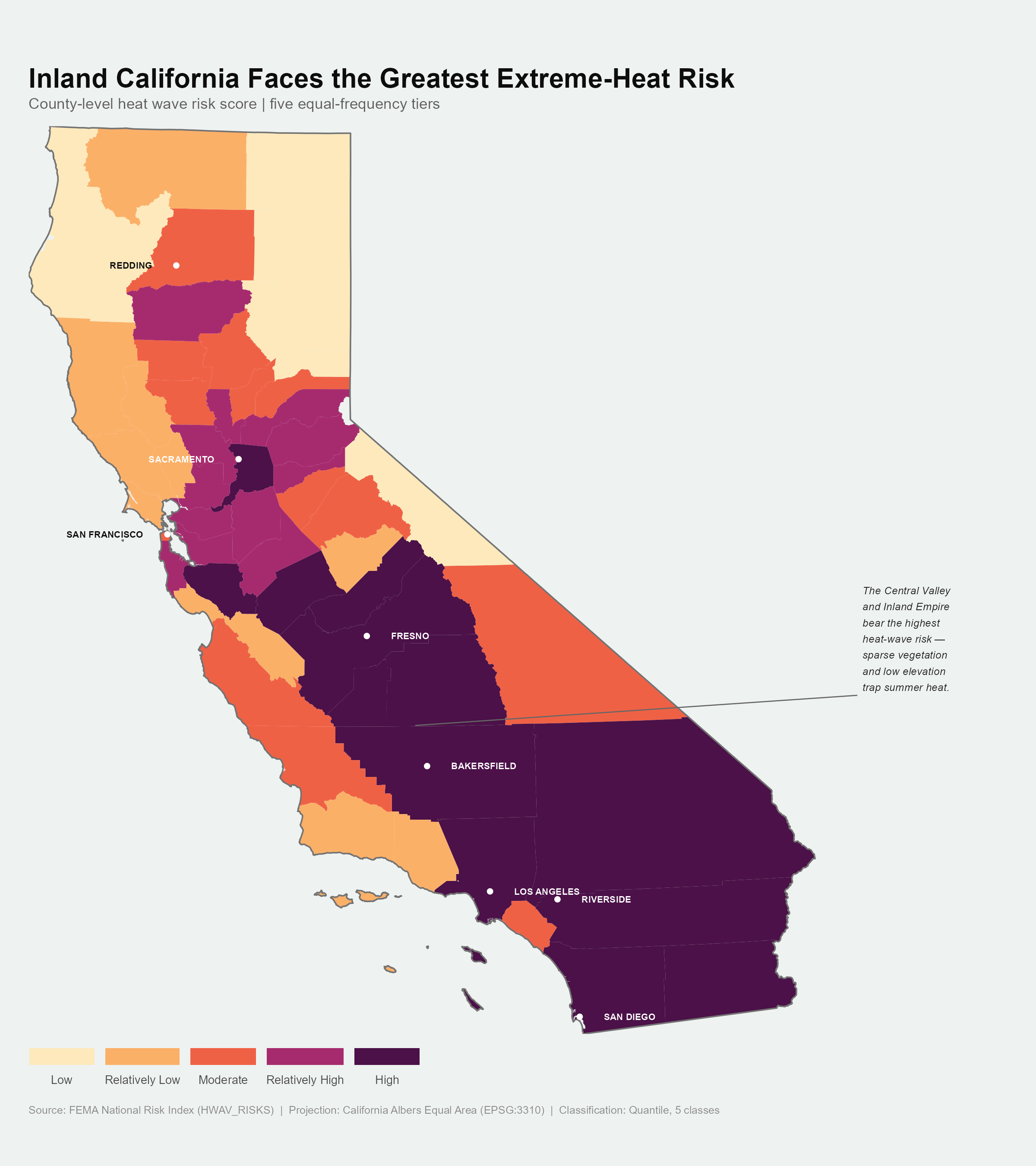
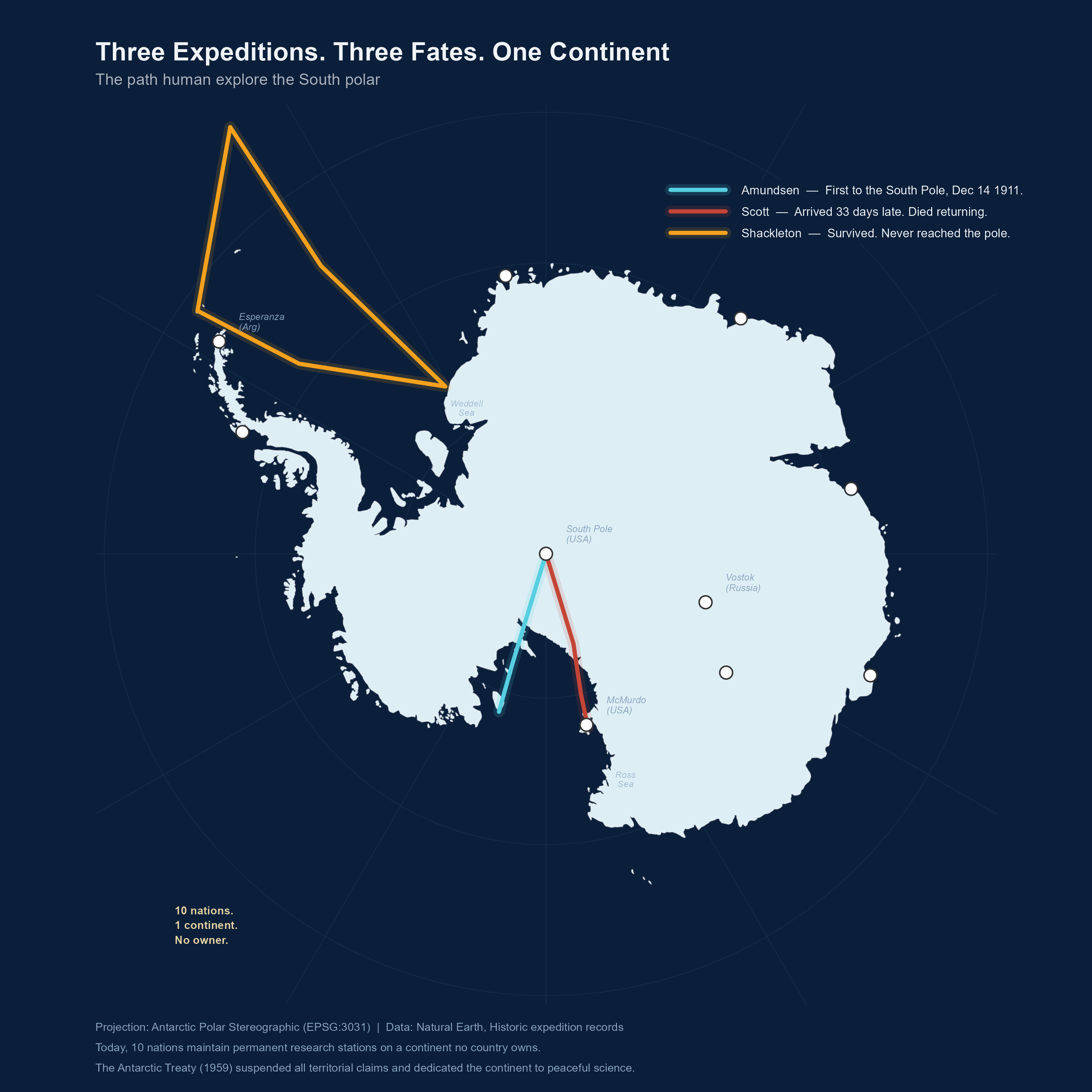
Plate II · Where the breaks go

Inland California bears the heat

County heat risk in five equal tiers. Two choices carry it: a projection that keeps areas true, and breaks that follow the data.

Data
FEMA National Risk Index
Projection
California Albers, EPSG:3310
Classes
Quantile, five
Color
Magma, light to dark
Choropleth map of California counties shaded by heat wave risk in five quantile tiers, with the Central Valley and Inland Empire in the darkest highest-risk class.
FEMA National Risk Index. California Albers Equal Area, five quantile classes.

San Bernardino alone could swallow a few states, so in Mercator the desert wins every map it turns up on. Albers keeps areas honest.

Which means the dark band down the Central Valley is real. Thin vegetation, low ground, trapped heat.

Plate III · Turning the world on its pole

Three expeditions. Three fates. One continent.

Amundsen got there first. Scott arrived thirty-three days later and died walking home. Shackleton never reached the pole and lost nobody.

Projection
Polar stereographic, EPSG:3031
Data
Natural Earth, expedition records
Color
One route, one outcome
Ground
Dark, so the ice reads first
Polar stereographic map of Antarctica on a dark navy background, showing the Amundsen, Scott, and Shackleton expedition routes in cyan, red, and orange, with research stations marked.
Antarctic Polar Stereographic. Natural Earth and historic expedition records.

In Mercator the South Pole is not a place, it is the whole bottom edge of the world. Turn the globe onto its pole and the smear becomes a continent with a middle. Only then do three routes converge.

Ten nations, one continent, no owner. A century on, nobody owns the ice.

Plate IV · Live

Two variables, one surface

Two distributions in one color, so you can see where they disagree. Also the map most likely to be misread, which is why it helps to hover.

Open the map

Every one of these was a decision.

None of it was hard. The projections are one line, the palettes have names, the data is public. The time went into choosing.

Which is why Plate I is here and not hidden. Copy something you admire closely enough and its choices become visible.

Charts are on Plot Makes Differences. Thirty more maps are in the 30 Day Map Challenge. The rest is in Thoughts.

Made with
R, sf, ggplot2, Leaflet
Plate I
After The New York Times, 2019
Plate II
FEMA National Risk Index
Plate III
Natural Earth
Plate IV
Hosted as a live map
Status
Still adding plates
Back to Thoughts