Ranked bars · Regional economies
Rust Belt cities still run on hospitals and universities
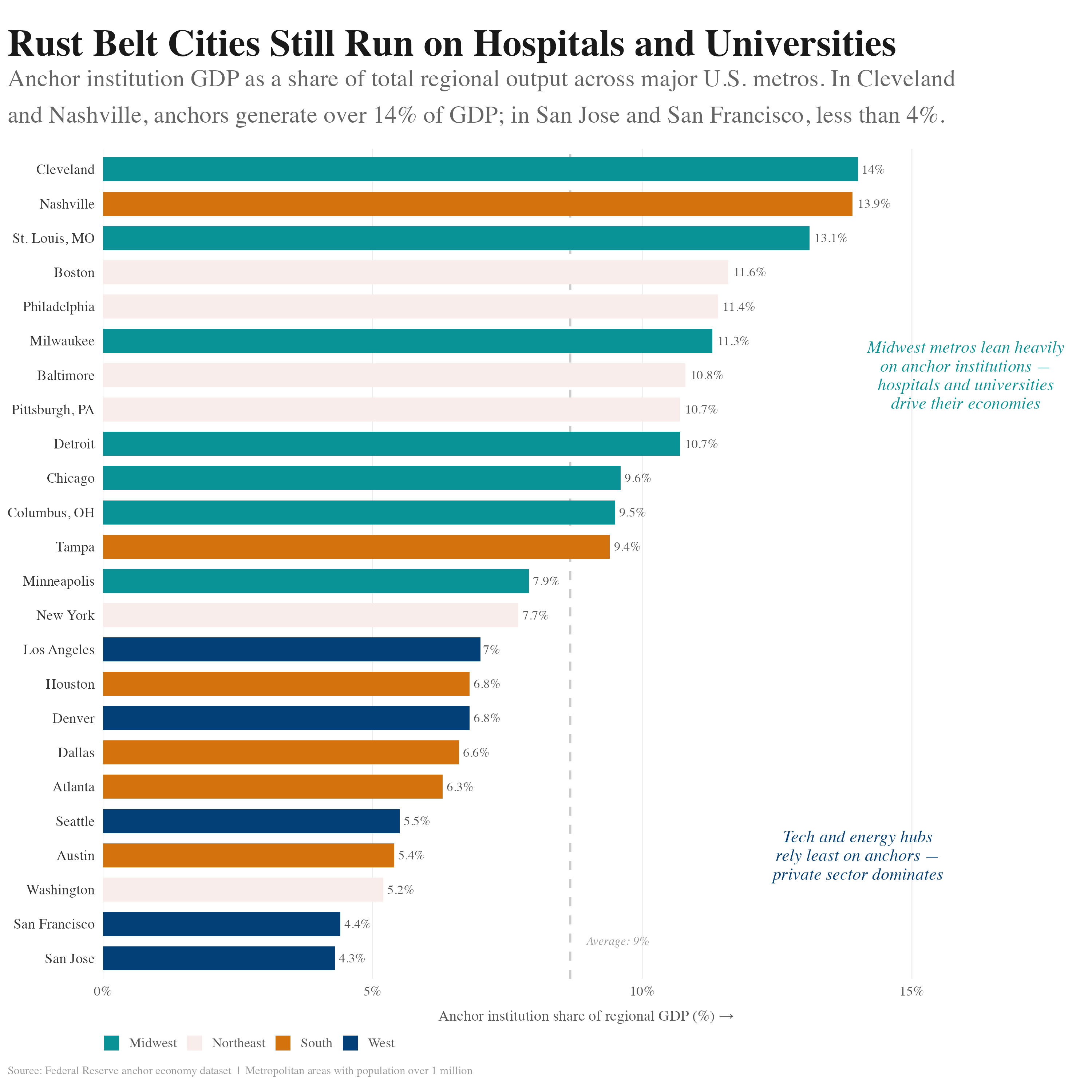
Two sentences sit inside the panel, one by the teal, one by the navy. Between them you learn what the colors mean, without leaving the chart.
Experiments Charts Three figures Seaborn · ggplot2
All three could have been tables. Same numbers, same honesty, nobody reading past the first row.
So each comes with its receipts.
Ranked bars · Regional economies
Two sentences sit inside the panel, one by the teal, one by the navy. Between them you learn what the colors mean, without leaving the chart.
Trend lines · Traffic speeds
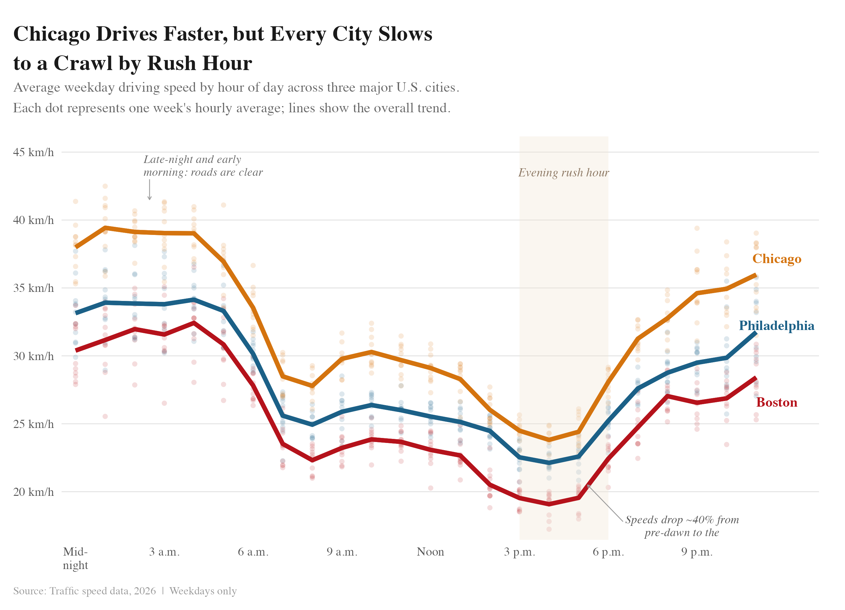
The faint dots are the raw weekly numbers, left in so you can see how noisy the measurement is. The bold lines stay the thing you follow.
Scatter · Pedestrian safety
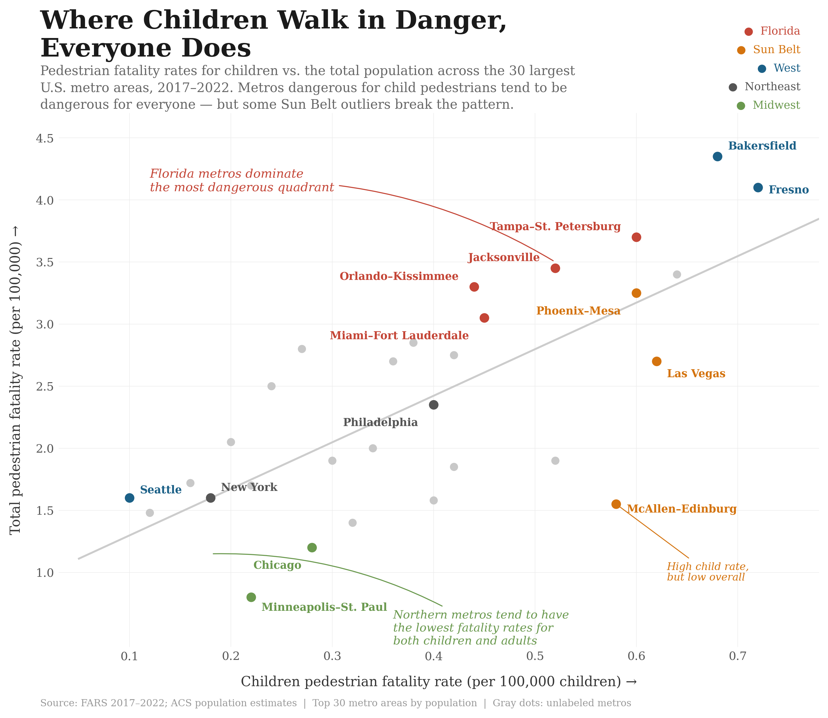
Thirty labels would be a mess. Most points stay gray and nameless, here to make the cloud. Only the metros with something to say get a name, and McAllen gets one for breaking it.
Because the plain version is not neutral. It was styled too, by software, for nobody in particular.
A headline that says something. A sentence inside the panel. A source line at the bottom. None of it is hard. It is mostly deciding to treat a figure as writing.
The maps are on North Is a Choice. The rest is in Thoughts.